Friday, September 22, 2017

Summer Send Off Stamp Camp - Birthday Sunflowers


When I think of sunflowers, I think of beautiful bright yellow-orange happy flowers.  Somewhere along the line, I spotted pink sunflowers!  OMG - I absolutely adore the Powder Pink layers along with Smokey Slate giving shadow in this 2-step stamped card.  

Look at my imperfect centers!  That's right, imperfection does not matter with this stamp set, Painted Harvest.  It welcomes imperfection.  

Don't like the first stamp impression?  Stamp it again!  These stamps practically beg you to do just that.  Each layer of stamp impression, gives this flower more depth and watercolor-y dreaminess.


So, go ahead and be imperfect.  Stamp and repeat.  The result is ideal.


Thank you for your visit.
Luci


P.S.  My next stamp camp is scheduled for October 13, 2017.  Pencil it in on your calendar and RSVP here.

Summer Send Off Stamp Camp - You Warm My Heart


I am beyond lucky that in the Fall, I can look out my studio window to see a spectacular show of vibrant and lavish colors so gracefully gifted to me by nature.  I can already see some of the early color-loving leaves presenting a dramatic brushstroke of red within a sea of a still-green forest.

OK… well enough about my view.  This card is the vision of what my view is to become.  There has been so much inspiration on the web for this type of design, so I will try to add what I think might be my personal touch, within the directions:

  • When all the inks are randomly stamped on the folder, lightly spritz the embossing folder with water.  (To add more drama, outline the tree section of the folder in brown marker).
  • Run a piece of Whisper White through the Big Shot to be "dry" embossed.  (Don't worry if the ink did not covering the entire background.  White areas make the colors pop.)
  • Sponge around the sides with Night of Navy to add more shadow and depth.
  • Layer the sentiment strip, doily and vellum as part of the card top embellishment.  Then add everything to the base of the card.
  • Add sparkle with 3 rhinestones, or in this case sequins.  HINT:  Apply a tiny drop of glue onto the woodland scene - where you want the sequins to go.  THEN, add the sequins on top of the glue.  It seems to work better that way, rather than adding glue to the sequins and then the card.
  • Want more shimmer?  I added additional twinkle with Wink of Stella on the birch tree trunks.


Thank you to all who generously offer inspiration and challenges on the web!  Feeling like Autumn, too?  Try the Autumn Colors challenge.


Have a beautiful day.

Luci


P.S.  My next stamp camp is scheduled for October 13, 2017.  Pencil it in on your calendar. 


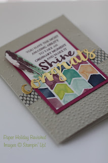
Summer Send-Off Stamp Camp - Gold Congrats


Here's another stamp camp design.  The 2017-18 SU catalog has a bevy of layout ideas.  This card was for the most part, cased for the shine and beautiful watercolor papers.  I liked the idea of using the snow folder as "confetti" in this happy card.


Feathers, being so trendy right now, seemed to fit perfectly on the left.  The best part of 2 step stamping the feather (which by the way has more than just 2 layers - so you can go crazy with the combinations of colors) is the 3 dimensionality and realistic shading of a feather image, which seems to mimic the watercolored style of the designer paper.

HINT:  I recommend that you put the washi tape on the card first, then run the card through the embossing folder.  That will adhere the tape firmly to the base of the card.


Thank you for stopping by.  
Luci


P.S.  My next stamp camp is scheduled for October 13, 2017.  Pencil it in on your calendar. 


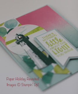
Summer Send Off Stamp Camp - The Light

Goodbye Summer 
Welcome Autumn


Happy first day of Fall 2017.  I've been wanting to post our farewell to summer cards from stamp camp, so here we go…

This has to be one of my favorite 2 step stamps (just to be clear, I have many favorites, and I really like this one). The light house is stamped with a darker shade to show the dramatic shadow of late summer sun on the other side.  

I cut out the lighthouse to add dimension to the layers, plus it provides a forgiving approach to hiding my non-perfect 2-step-stamp line-up.  Beneath the lighthouse are the lime-light beams stamped on a circle shape of seagulls and waves.


What else are my favorites?
  • I think the Lemon Lime Twist In-Color is such a wonderfully trendy color that updates whatever other color combos are used.  
  • I cannot get enough of the delicate rhinestones.  Here it is used as the "light" in the lighthouse.
  • The sponge brayered inks on the glossy can't be beat. 
  • Did I mention glossy cardstock is back?!  YAY!


Lastly, I adore the sentiment.  I am so grateful to have people in my life that shine beautiful light… so grateful.


Wishing you a peaceful day,
Luci


P.S.  My next stamp camp is scheduled for October 13, 2017.  Pencil it in on your calendar. 

Thursday, September 21, 2017

When Words Are Not Enough to Say Thank You


I was honored to be asked to make a special thank you card.  After listening to the request, I realized this card had to be something more than special - it had to be full of love, because of the kindness that was offered in the aid that contributed to my friend's long recovery.  Words, I felt, could not be enough.

So, with that in mind, I set to work and here is the result:


You can see there is a combination of of stamped sentiment, sponged edges, layered florals, and thinlit die cuts.  


While I wanted the colors to be subdued and soft, I found the perfect shade of pop (Watermelon Wonder - In Color '16), and made a layered flower.  To make this flower, I punched 4 layers of card stock, fastened them together with a tiny SU brad, then rolled each petal up until I liked the look.  This took a bit of time and fuss… and love.


The butterfly on top of the note tag is a layered with multiple punches to repeat the shape, adding dimension, texture and even a little flutter.  The gold die cut center adds the shine.  The personal note tag can be pulled out from the pocket by the burlap ribbon.


My favorite little accent is this detail in the corner.  I cut, rolled and sponged a layer of the designer paper to create a curl that I purposely made to reveal a subtle bird in flight… freedom.

Above the curl, I added a rhinestone accent and a piece of a doily.  Did I mention that I love texture?


This card helped me to slow down and enjoy each layer as I built it, loving each piece.  Maybe I achieved the goal for making this thank you card after all - it had to be filled with love.


NOTE:  There are some ideas that made this card in the "flying spirit of birds" from Time Out Challenges.  Were you able to find my winged friends - and their spirit - in this card?  Thank you Steph for recommending!


May your day be filled with creative joy.
Luci


Related Posts Plugin for WordPress, Blogger...